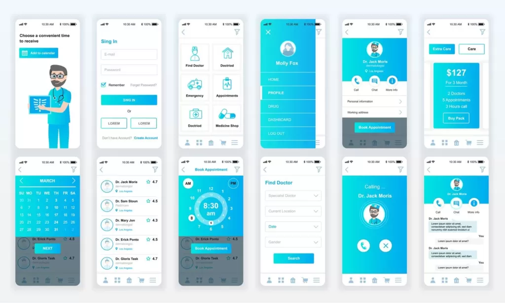
Designing a user interface (UI) prototype for a mobile application can be an exciting and rewarding process. With the right approach, you can create something that is both visually appealing and highly functional. To do this, it’s important to understand the underlying UI design principles, research your target audience, create a wireframe to visualize your app’s structure, develop interesting interactions for each screen, test out different color schemes and fonts, and use prototyping tools to bring your designs to life. Taking these steps will help ensure that you have created an effective UI prototype for your mobile application.
What is a UI prototype?
Creating a UI prototype for a mobile application is an important step in the development process. It helps designers present the basic design and flow of an app and can be used to solicit feedback from stakeholders before investing in more detailed product design. But what is a UI prototype? Essentially, it’s a fake version of the user interface.
By drafting screens with various components such as buttons, text fields, and navigation elements, you are able to explore the look and feel of your product without actually rebuilding it from scratch using expensive development tools. If you’re looking to learn more about how to design your own UI Prototype, read this article for helpful tips!
1. Understand the User Interface Design Principles
Designing a UI prototype for mobile applications takes time and effort, but the work will pay off in the end. The first step should be to familiarize yourself with the basic concepts of User Interface Design. These design principles, such as consistency, visibility, feedback, and layout, help to create an intuitive experience for users of the app.
They also provide a strong foundation for structuring the visual design of your mobile application. If you understand these core concepts, you’ll be well-equipped to build a meaningful UI prototype that is attractive and efficient. A great user interface allows people to get the most from your app – here’s how you can make sure yours is one of them!
2. Research and Analyze Your Target Audience
Step 2 of designing a UI Prototype for Mobile Applications is to research and analyze your target audience. This step is absolutely critical because it requires you to think like the user, allowing you to be familiar with their wants and needs. You need to figure out:
- which type of users will be using the mobile application, and determine what they expect from it
- how they want it to appear in order to effectively meet their expectations and deliver a useful product.
Being aware of user preferences can help inform design decisions by focusing on responsive layouts that are easy to use and provide a pleasant experience. Taking the time to understand your users’ behavior will actually save you time and effort in the long run as it helps ensure that you create an application that resonates with them – resulting in higher user satisfaction levels!
3. Create a Wireframe to Visualize Your App’s Structure
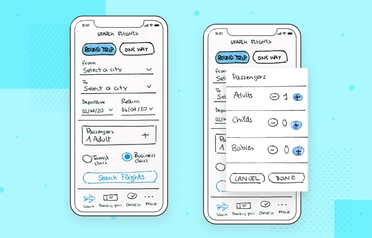
After you’ve mapped out the idea for your mobile app, it’s time to tackle the next step in developing its UI prototype: creating a wireframe. A wireframe is essentially a visual representation of your app’s user interface components and how they interact with each other. It’s an invaluable tool that can provide you with valuable insights on how to strategize your app layout’s structure in advance.
When designing your wireframe, remember to remain focused on the user experience so that your app’s capabilities shine through. Focus on simplicity while striving for maximum user engagement to create an effective UI prototype!
4. Develop Interesting Interactions for Each Screen
When it comes to creating an effective UI prototype for your mobile application, Step 4 is all about making sure the user enjoys their experience. Interactions are key and it’s important to make sure each screen has something interesting that users can do.
Think about layering on subtle animations and transitions which provide a bit of added delight when interacting with the interface. Similarly, providing helpful hints in the form of tooltips or inline help allow users to get up to speed quickly and easily.
Experimenting with interactive components such as sliders or drop-downs offers another layer of functionality that makes a user’s time with the application memorable – from one touch to the next!

5. Test Out Different Color Schemes and Fonts
After nailing down the basic layout and navigation, testing out different color schemes and fonts is a great way to give your prototype its personality. Don’t be afraid to get creative here! While it’s important to be aware of color theory principles—like alternating colors across the design or using bright colors for call-to-action items—putting too strict of rules on yourself could limit how far you can push your design.
Remember that contrast is important for visibility, so you want to pick two or three colors that look good together but still provide enough contrast when needed. When it comes to fonts, style cues such as font size, capitalization, or spacing can help convey hierarchy and give some elements more focus. Keep in mind that readability should come first when choosing a font.
Try out different combinations until everything looks just right because if there’s one thing we know, it’s that details are what make a UI special.
6. Use Prototyping Tools to Bring Your Designs to Life
Prototyping tools give your UI designs life and realism; they’re like the magic that transforms paper sketches and wireframes into realistic, interactive visualizations of what a user will experience with the mobile application.
With these powerful design tools, you can create an interactive prototype of your mobile app, giving potential users the ability to explore and test out the design. Prototyping allows you to see the different levels of user-application interaction:
- think menus
- submenus
- sidebars
- sliders
- notifications
Your prototype can also be used for beta testing to provide feedback on how usable and intuitive your designs are. Making use of prototyping tools is an exciting way to make sure your UI is up and running smoothly before taking it live!
Conclusion
Creating an effective UI prototype for your mobile app requires a lot of careful planning and consideration. From developing interesting interactions to testing out different color schemes, fonts, and prototyping tools – the process can be time-consuming but well worth it in the end! By following the steps outlined above you’ll have a much better chance of creating an intuitive user experience that will help boost engagement with your application.
Taking the extra time to design a great UI is essential if you want users to keep coming back so don’t forget to make sure every step is taken into account before launching your final product!


